Bringing an Andy Warhol print into your home is not merely a decorative decision; it is a declaration of intent. When you acquire a piece by the Pope of Pop Art—whether it is the vibrant repetition of the Campbell’s Soup Cans, the iconic gaze of Marilyn Monroe, or the bold petals of his Flowers series—you are introducing a massive injection of cultural history, color theory, and irony into your living space.
However, Pop Art is demanding. Unlike a serene landscape that blends quietly into the background, a Warhol print is designed to disrupt, to question, and to dominate. It does not whisper; it speaks. Consequently, the way you display it determines whether your room feels like a sophisticated private gallery or a chaotic college dormitory.
At Vereness, we believe that art finds its true voice only when it resonates with the space around it. To help you honor the legacy of this master, we have curated a comprehensive, step-by-step guide on how to display your Andy Warhol print with the elegance, precision, and boldness it deserves.
Part 1: Understanding the Warhol Aesthetic
The Psychology of Pop in the Home
Before hammering a single nail, it is crucial to understand the “physics” of a Warhol piece. Andy Warhol’s work operates on the principles of repetition, saturation, and decontextualization. He took mundane objects and celebrities and elevated them to high art through industrial processes.
When placing this in a home, you must account for its “visual weight.” A Warhol print, even a small one, is heavy. It draws the eye instantly.
-
The Energy: Pop Art is inherently high-energy. It works best in social spaces (living rooms, dining areas, foyers) where conversation happens. It can sometimes be too stimulating for spaces designed for deep rest, like a master bedroom, unless chosen carefully (e.g., his softer Sunset series).
-
The Modernity: While Warhol is timeless, his aesthetic is undeniably modern. Does this mean you cannot hang a Warhol in a room with antique furniture? Absolutely not. In fact, the juxtaposition of a 1960s Pop Art print against a 19th-century velvet armchair creates a tension that is the hallmark of eclectic luxury.
Part 2: The Art of Framing
Containing the Explosion
The frame is the boundary between the art and the world. With Warhol, the frame has a specific job: to contain the explosion of color without competing with it. A common mistake is over-framing Pop Art with ornate, gilded, or distracting moldings.
1. The Gallery Minimalist Approach (Recommended)
The most sophisticated way to frame a Warhol is to mimic the museum aesthetic.
-
The Profile: Choose a thin, square-profile molding.
-
The Color: Matte Black or Arctic White are the gold standards. A black frame acts as a strong container, solidifying the graphic lines of the print. A white frame allows the image to “float” and feel airier, perfect for lighter interiors.
-
The Matting (Passe-partout): Warhol’s prints often go right to the edge, but adding a generous white mat (3 to 5 inches) adds a layer of breathing room that elevates the print from “poster” to “fine art.”
2. The Floating Mount
For a truly contemporary look, consider “floating” the print. This involves mounting the artwork on a backing board so that it sits slightly raised from the background mat, creating a shadow around the edges. This technique highlights the paper quality—an essential factor when dealing with the fine art prints we curate at Vereness—and emphasizes the object-hood of the artwork.
3. To Glass or Not to Glass?
Always use glass, but not just any glass. Pop Art relies on pigment saturation.
-
Museum Glass (Anti-Reflective): This is non-negotiable for high-end prints. Standard glass creates glare that obscures the image. Museum glass is virtually invisible, allowing you to see the true colors without reflection.
-
UV Protection: Warhol’s colors (especially his fluorescent pinks and yellows) are susceptible to fading. Ensure your glazier uses UV-filtering glass to preserve the vibrancy of your investment for decades.
Part 3: Placement and Lighting
Giving the Icon Its Stage
Once framed, the question becomes: Where does it live?
The “57-Inch” Rule
There is a universal standard used by galleries and museums known as the “57-inch rule.” The center of your artwork should be exactly 57 inches (approx. 145 cm) from the floor. This represents the average human eye level.
-
Exception: If you are hanging the art in a dining room or a lounge where people are primarily sitting, you can lower this center point to match the seated eye level, ensuring the connection remains intimate.
Lighting: The Vital Ingredient
Pop Art dies in the dark. To showcase Pop Art effectively, you need to treat light as a sculpting tool.
-
Avoid Direct Sunlight: Never place a Warhol on a wall that receives direct, harsh sunlight. Even with UV glass, the heat and intensity can damage the paper over time.
-
Spotlighting: If possible, install a ceiling track light or a picture light. Use a bulb with a high CRI (Color Rendering Index)—ideally above 90. This ensures that the reds look red and the blues look blue, rather than being washed out by yellow or blue-tinted artificial light. A warm-neutral temperature (3000K) usually complements domestic interiors best.
Part 4: Configuration Strategies
Grid, Solo, or Salon?
Warhol was the master of the series. He rarely created just one Marilyn or one Soup Can. He created variations. This gives you three distinct strategies for display.
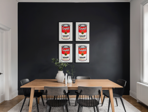
Strategy A: The Grid (The Purist Choice)
If you own a set (e.g., four variations of Marilyn or a set of Campbell’s Soups), the most powerful way to display them is in a tight geometric grid.
-
The Layout: Hang them in a square (2×2) or a horizontal line (1×4).
-
The Spacing: Keep the gap between frames tight—between 2 to 3 inches (5-7 cm). This creates a “gestalt” effect, where the four individual frames are read by the brain as one massive, impactful artwork. This is pure Warhol: the power of industrial repetition.
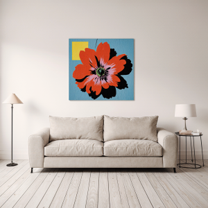
Strategy B: The Solo Statement (The Hero Piece)
If you have a single, large-scale Warhol print, treat it as the “Hero” of the room.
-
Isolation: Give it a wall to itself. Do not crowd it with sconces, shelves, or plants. Let the negative space around the frame amplify the noise of the image.
-
Furniture Anchoring: Center it perfectly above a major piece of furniture, like a sofa, a sideboard, or a fireplace mantel. The width of the artwork should ideally be between 60% and 75% of the width of the furniture below it for visual balance.
Strategy C: The Eclectic Salon (The Collector’s Choice)
For the bold interior designer, a Warhol can be the crown jewel of a “Salon Wall” (a curated mix of various artworks hung together).
-
The Contrast: Place the Warhol next to something radically different—an oil landscape, a black and white architectural photograph, or a botanical sketch.
-
The Hierarchy: In a salon wall, the Warhol will naturally draw the eye first due to its color. Place it slightly off-center to keep the eye moving across the collection, or in the center to act as the sun around which the other “planets” orbit.
Part 5: Color Theory and Interior Dialogue
Designing the Room Around the Art
A Warhol print is not passive; it exerts a gravitational pull on the room’s color palette. How do you harmonize your furniture and walls with such bold colors?
Path 1: The White Cube (The Gallery Look)
The safest and most classic approach. Paint your walls a crisp, gallery white (like Benjamin Moore’s Chantilly Lace or Farrow & Ball’s All White). Keep the furniture neutral—greys, linens, black leather.
-
Why it works: The room disappears, and the art pops. It feels clean, modern, and intellectual.
-
The Vereness Touch: Add texture (a wool rug, a velvet cushion) so the room doesn’t feel sterile.
Path 2: The Chromatic Echo (The Designer Look)
Pick one secondary color from the Warhol print and repeat it in the room—but subtly.
-
Example: If you have a Marilyn with a turquoise background and yellow hair, add a pair of turquoise velvet pillows to the sofa or a yellow ceramic vase on the coffee table.
-
The Rule: Don’t overdo it. Two or three “echoes” are enough. If you match everything, the room looks themed and cheap.
Path 3: The Dark Drama (The Moody Look)
Pop Art looks incredibly sophisticated against dark walls. Imagine a neon-bright Flower print against a wall painted in Charcoal Grey, Navy Blue, or Forest Green.
-
The Effect: The dark background absorbs the light, making the bright colors of the print appear to glow or phosphoresce. It creates an intimate, club-like atmosphere perfect for dining rooms or studies.
Part 6: Preservation and Care
Protecting Your Investment
At Vereness, we provide fine art prints meant to last a lifetime. However, paper is organic and fragile. Displaying your art correctly also means protecting it from environmental aggressors.
-
Humidity Control: Never hang a valuable fine art print in a bathroom. The humidity fluctuation causes the paper to expand and contract, leading to “rippling” or cockling inside the frame. It can also encourage mold growth.
-
Heat Sources: Avoid hanging art directly above a working radiator or a fireplace that gets very hot. The rising heat can dry out the paper fibers, making them brittle over time.
-
Cleaning: Never spray cleaning fluid directly onto the glass. The liquid can seep down the glass, get under the frame, and stain the mat or the art. Spray a microfiber cloth first, then gently wipe the glass.
Living with Legend
Hanging an Andy Warhol print is the final step in a journey of curation. It transforms a room from a static space into a dynamic environment. It tells guests that you appreciate history, that you understand irony, and that you are not afraid of color.
Whether you choose a strict grid of Soup Cans in a minimalist kitchen or a solitary, vibrant portrait in a moody study, the key is intention. Do not just fill a space; curate a moment.
At Vereness, we invite you to explore our collection of Pop Art and fine art prints. Find the piece that challenges you, delight in the process of displaying it, and let the art speak to your soul.
FAQ: Quick Tips for the Pop Art Collector
Q: Can I hang Warhol prints without a frame? A: We strongly advise against it. While you might see posters taped to walls in magazines, a fine art print requires the structure and protection of a frame to maintain its value and aesthetic integrity.
Q: How do I handle the print before framing? A: Ideally, don’t. Let your framer handle it. If you must, wear white cotton gloves. The oils from your fingertips can damage the paper surface or leave invisible marks that darken over time.
Q: Does the frame color have to match the furniture? A: No. The frame should serve the art, not the sofa. When in doubt, black or white is timeless. Wood tones should be used carefully with Pop Art, as they can sometimes clash with the industrial, synthetic nature of the imagery.